2021
Ziina MENA Digital Wallet
Entrant Company
Ziina
Category
Mobile Apps & Sites - Finance / Banking
Client's Name
Ziina
Country / Region
United Arab Emirates
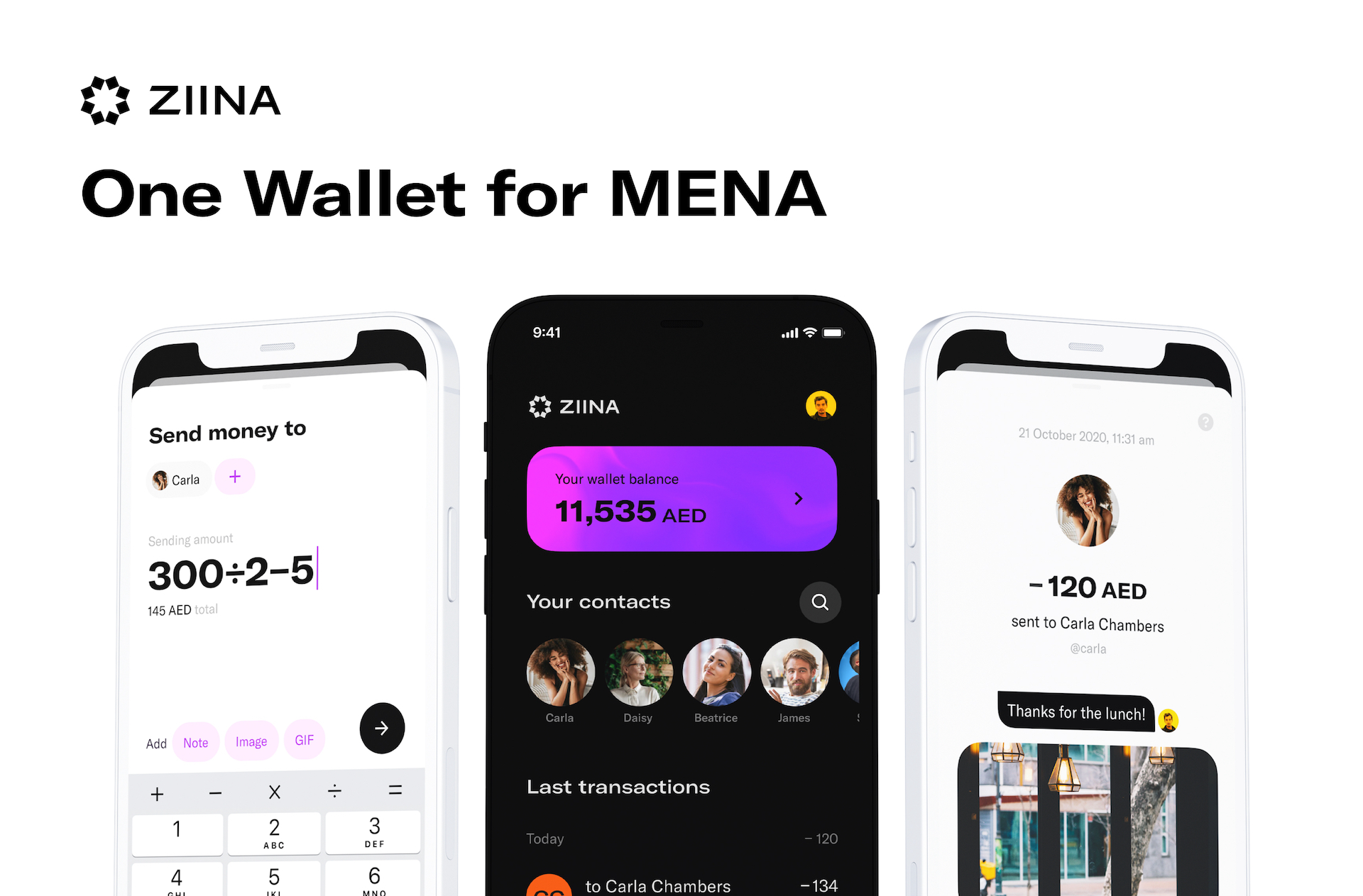
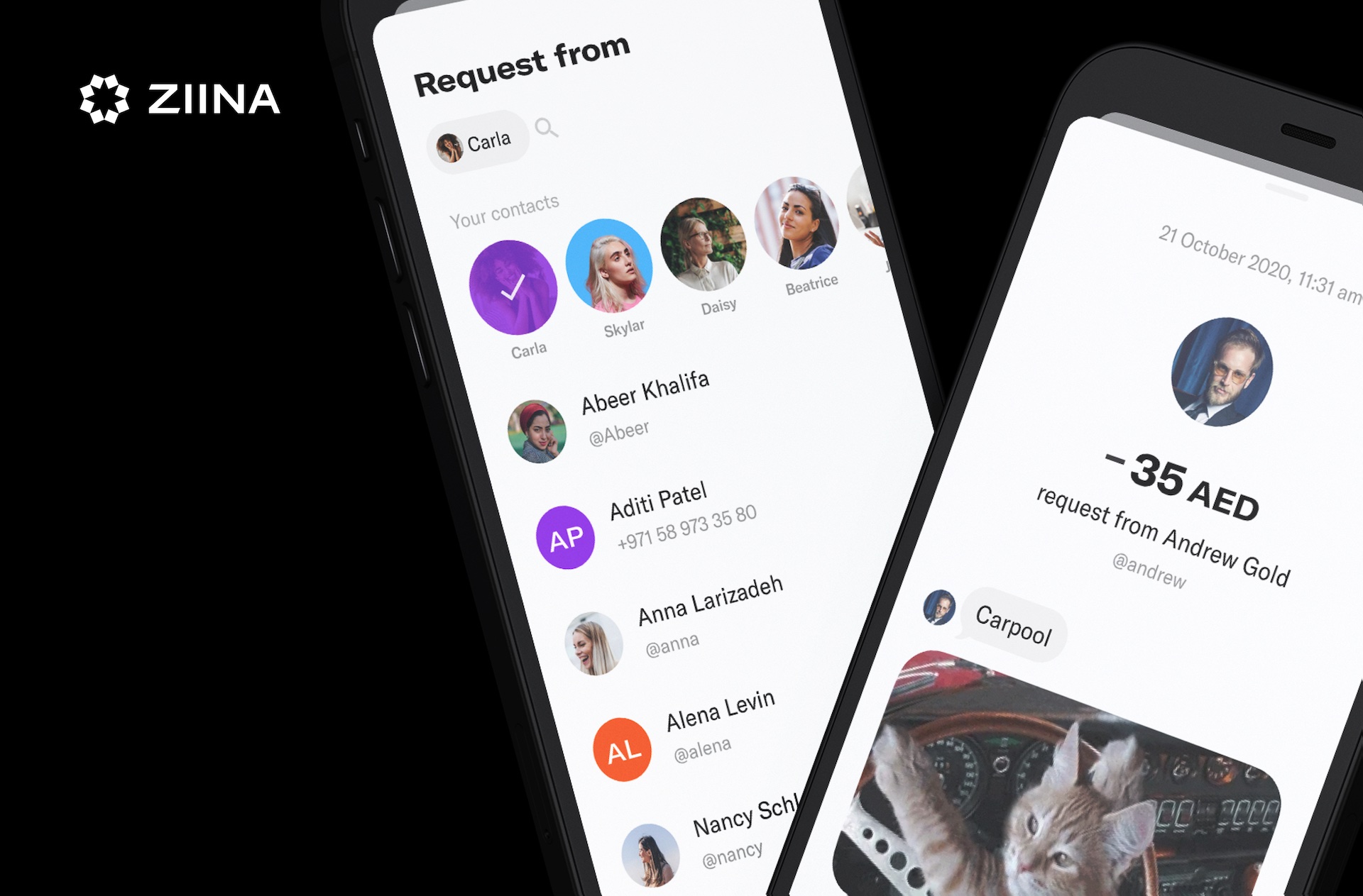
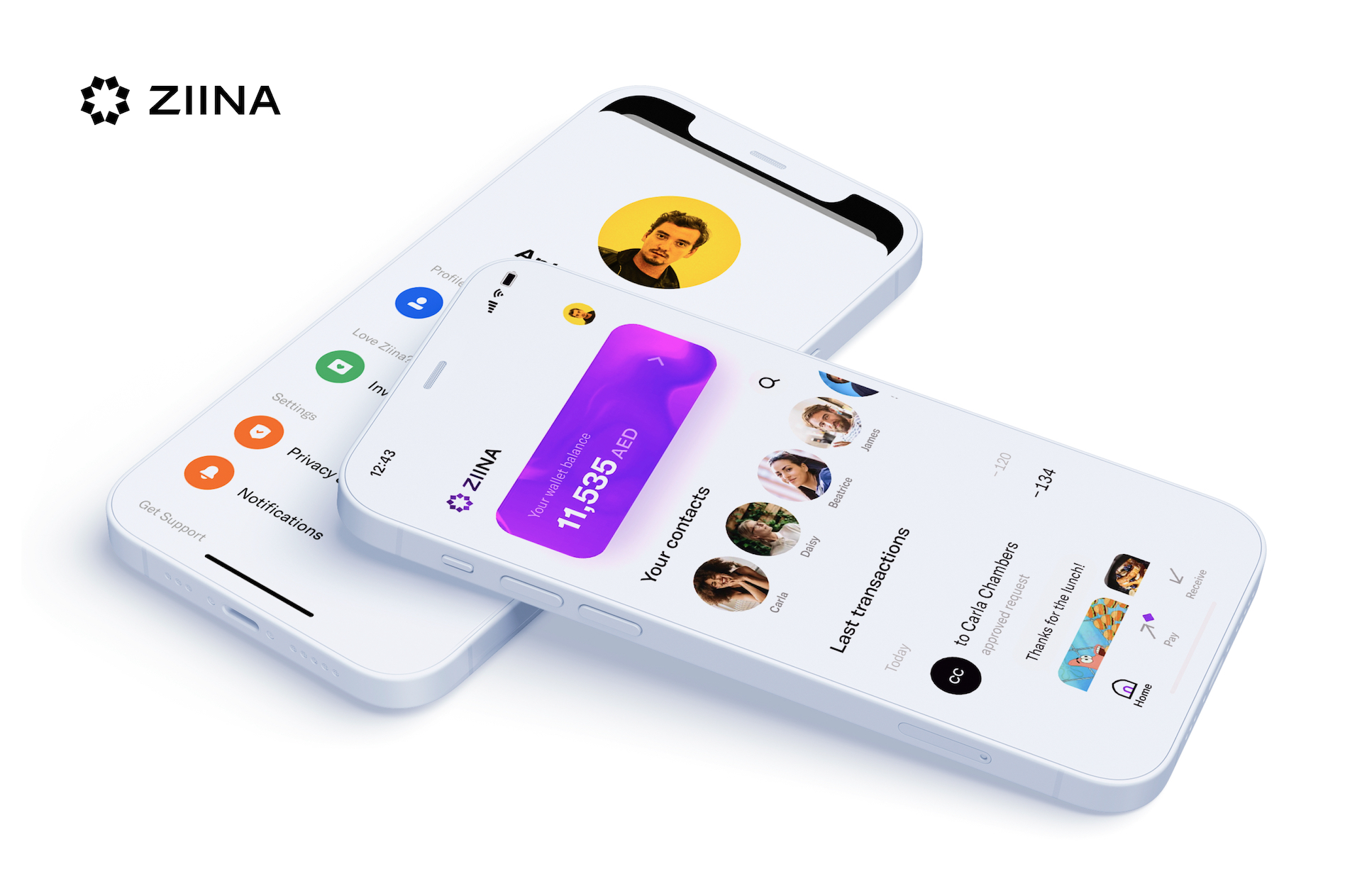
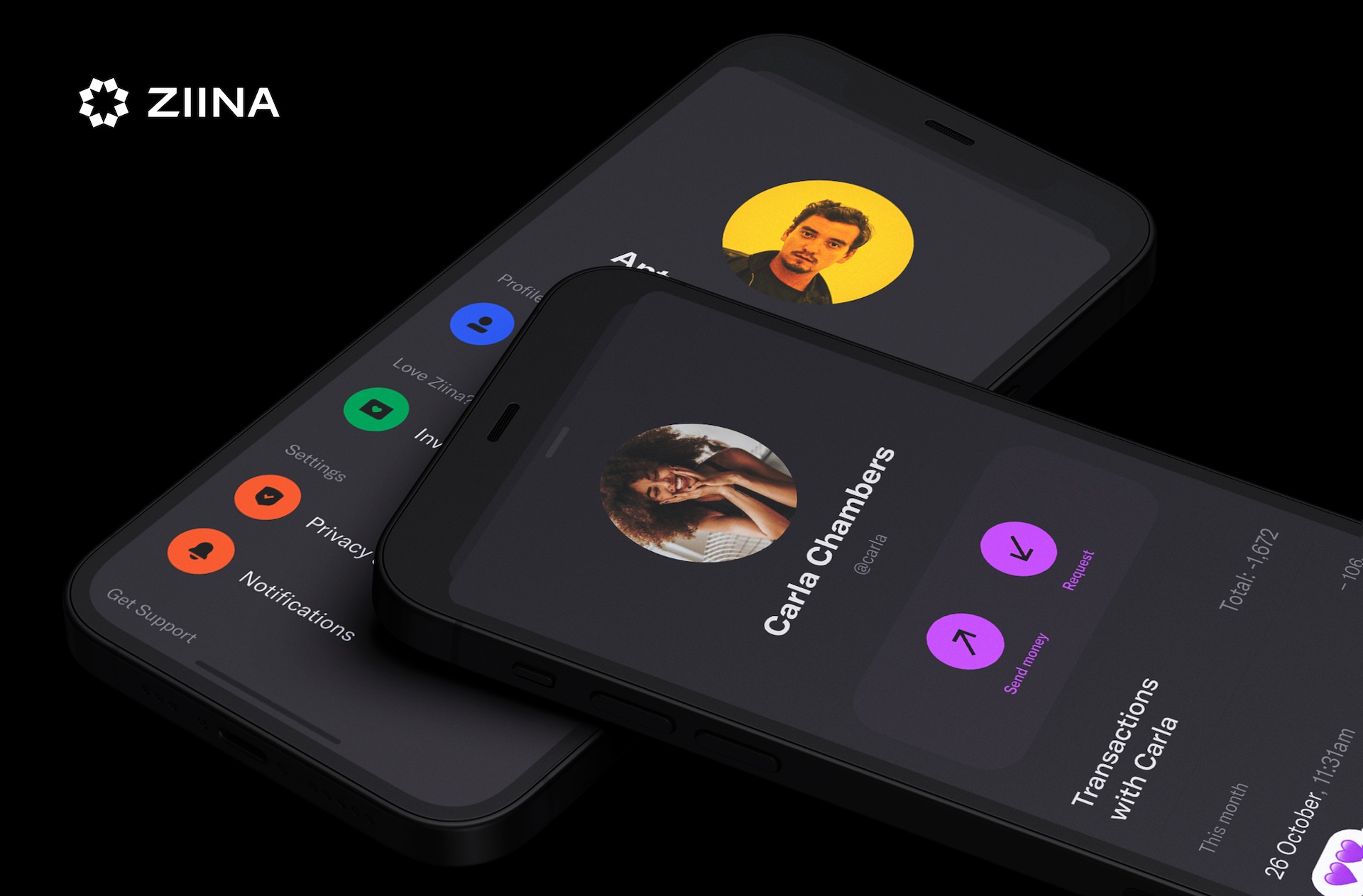
Ziina is a new digital wallet for the Middle East. The team goal is to design the most beautiful yet extremely simple product that enables instant payments for people in the region. The app is built for network effect, allowing users to easily send money and invite friends. Ziina meant to be social, unlocking its full potential when a person’s close circle of friends is onboard. The product is created to bring delight, also allowing people to share joy and emotions with their friends.
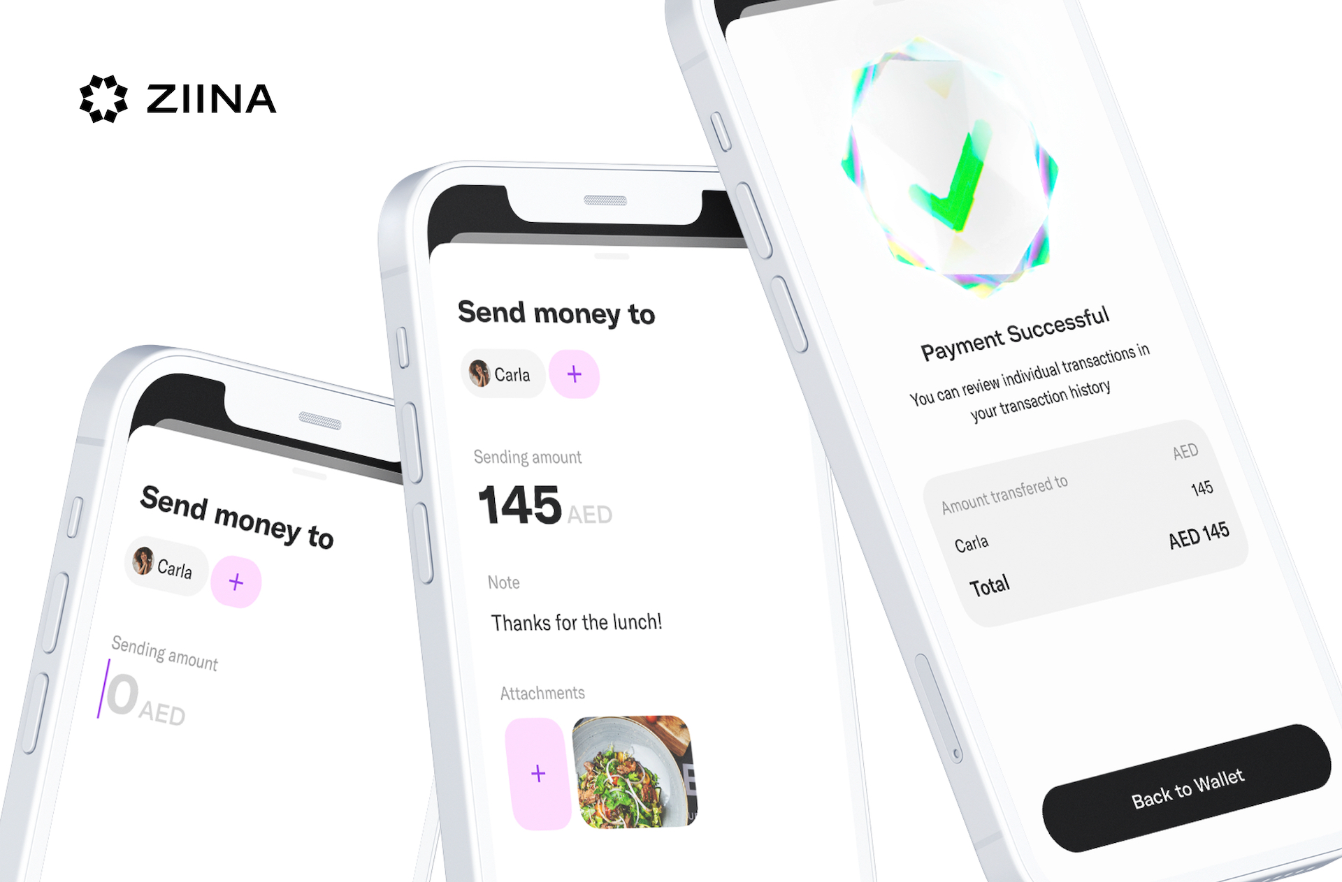
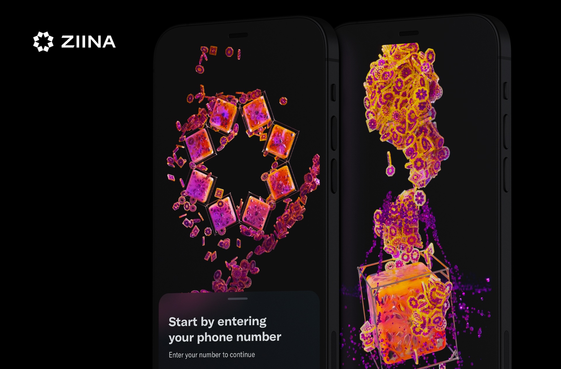
Sending and receiving money online is not an easy task in Dubai. Most existing solutions require exchanging IBANs and SWIFT codes and take up to 3 days to complete payment. Ziina’s team conducted extensive research to come up with a unique and most user-centric solution for this problem. The design is inspired by local culture and architecture yet cutting-edge and technologically advanced. Ziina meant to be the product where finances meet art.
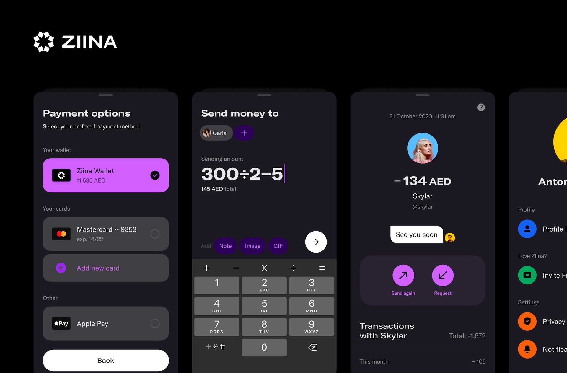
There are a lot of taboos formed around money in the region. Sometimes it’s not appropriate to discuss finances, remind other people of debts, and so on. One of the key challenges of the product was to design an experience that streamlines communications around money removing existing barriers. Brining to the finance app product social feature and allowing people to include GIF in transactions remove the awkwardness from finance interactions.
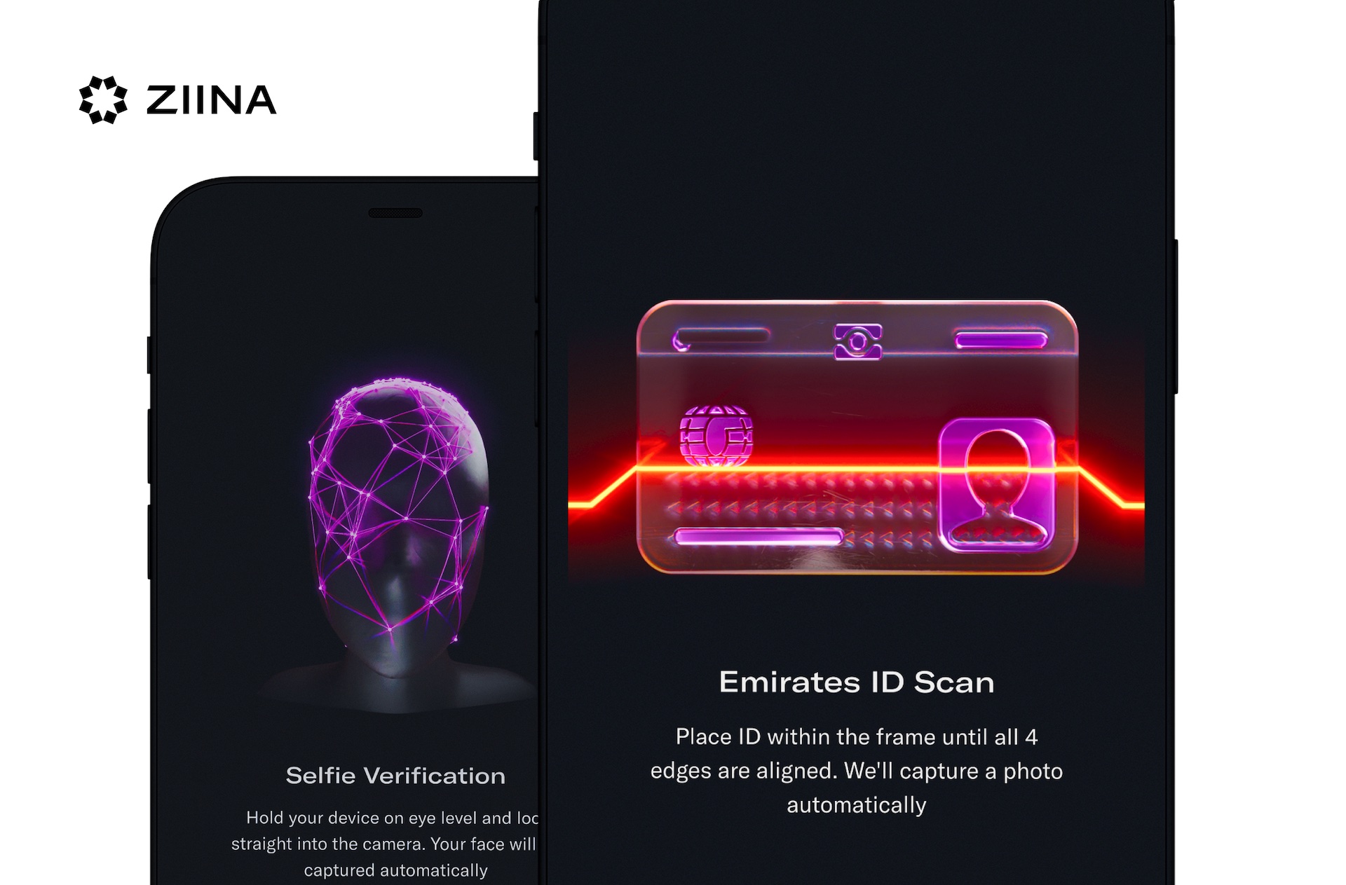
The app was built in-house with a lot of preliminary user research and user testing.
1. Need-finding interviews to understand users and their pain points.
2. Concepts-testing phase with target segments to tackle the surfaced opportunities and pain-points.
3. Online payment mental model research
4. Designing a North Star experience to see how an ideal product would come together.
5. User-testing the product to streamline the experience and validate the hypotheses.
The app is designed with keeping accessibility in mind. Frequent interaction elements were moved close to the bottom part of the screen allowing easier single-hand usage. The typography is designed to have a minimal size of 15pt for body text and with an accessible contrast ratio.
Credits
Entrant Company
Lost Boys School of Visual Effects
Student - Video / Online Video - Visual Effects
Country / Region
Canada


Entrant Company
Bottle Rocket Media
Video / Online Video (Single) - Documentary - Short Form (<5 mins)
Country / Region
United States


Entrant Company
The Brand Agency
Social Content & Marketing - Sports
Country / Region
United States
