2021
RZON
Entrant Company
Cheeers Design Consulting Co., Ltd.
Category
Digital Marketing - Branding / CI
Client's Name
RZON Tech
Country / Region
China
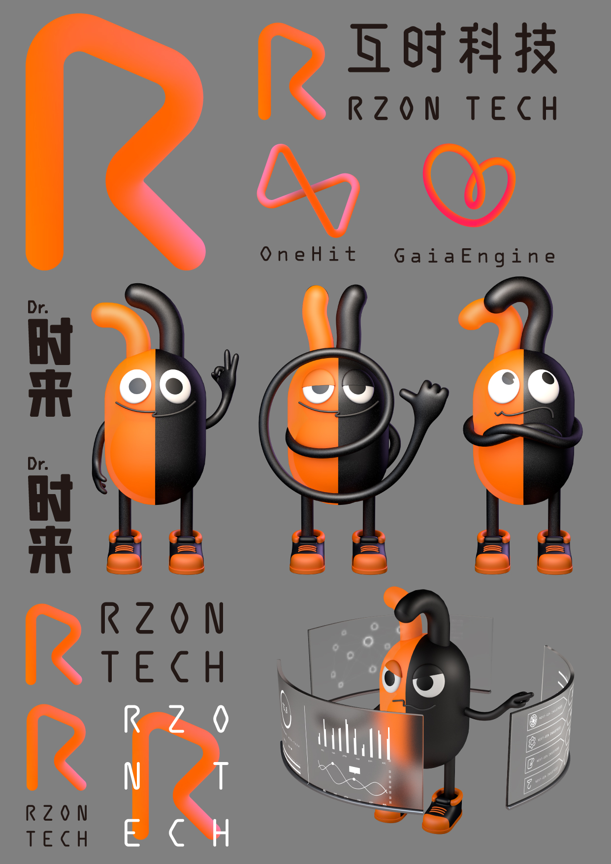
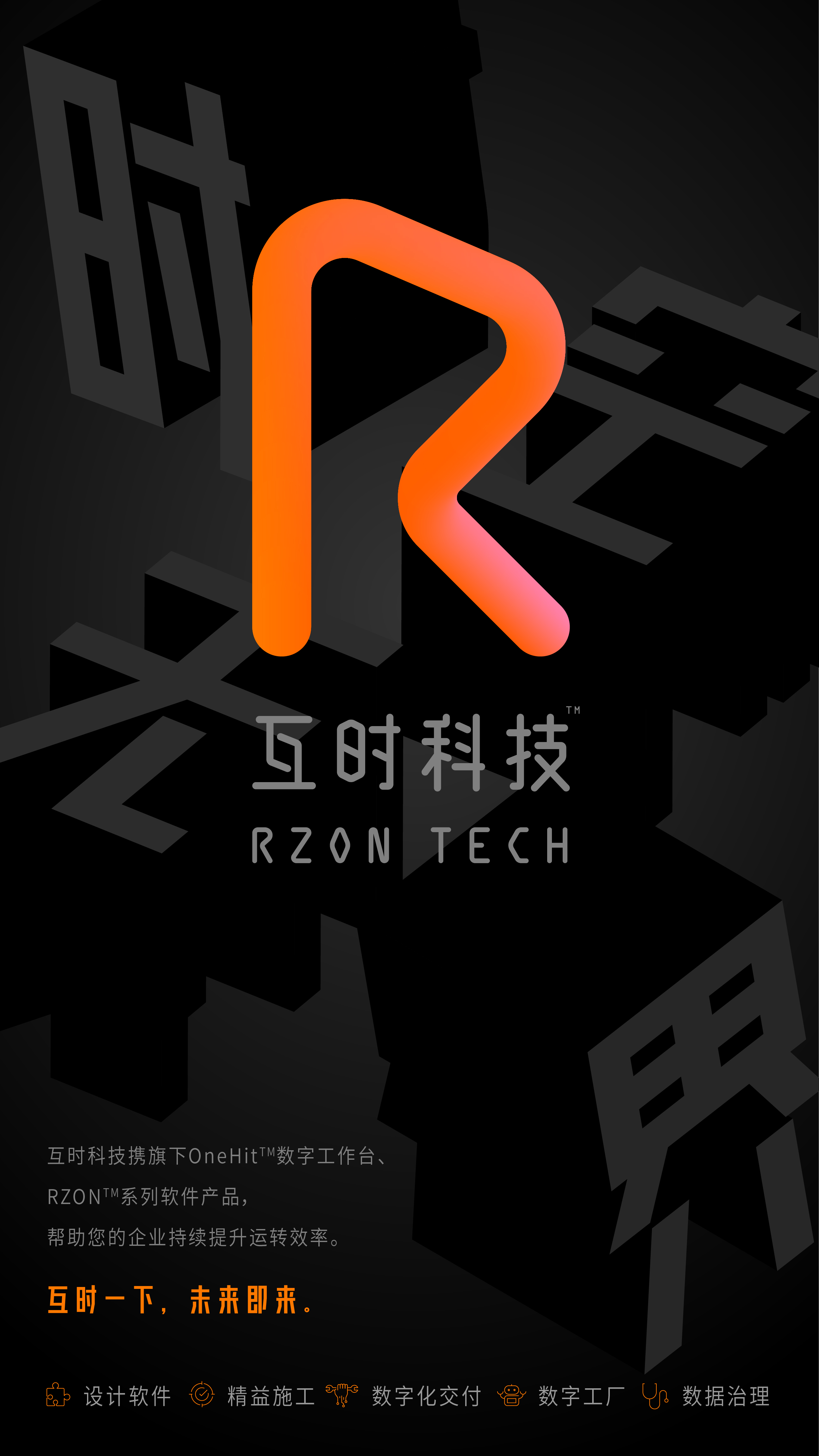
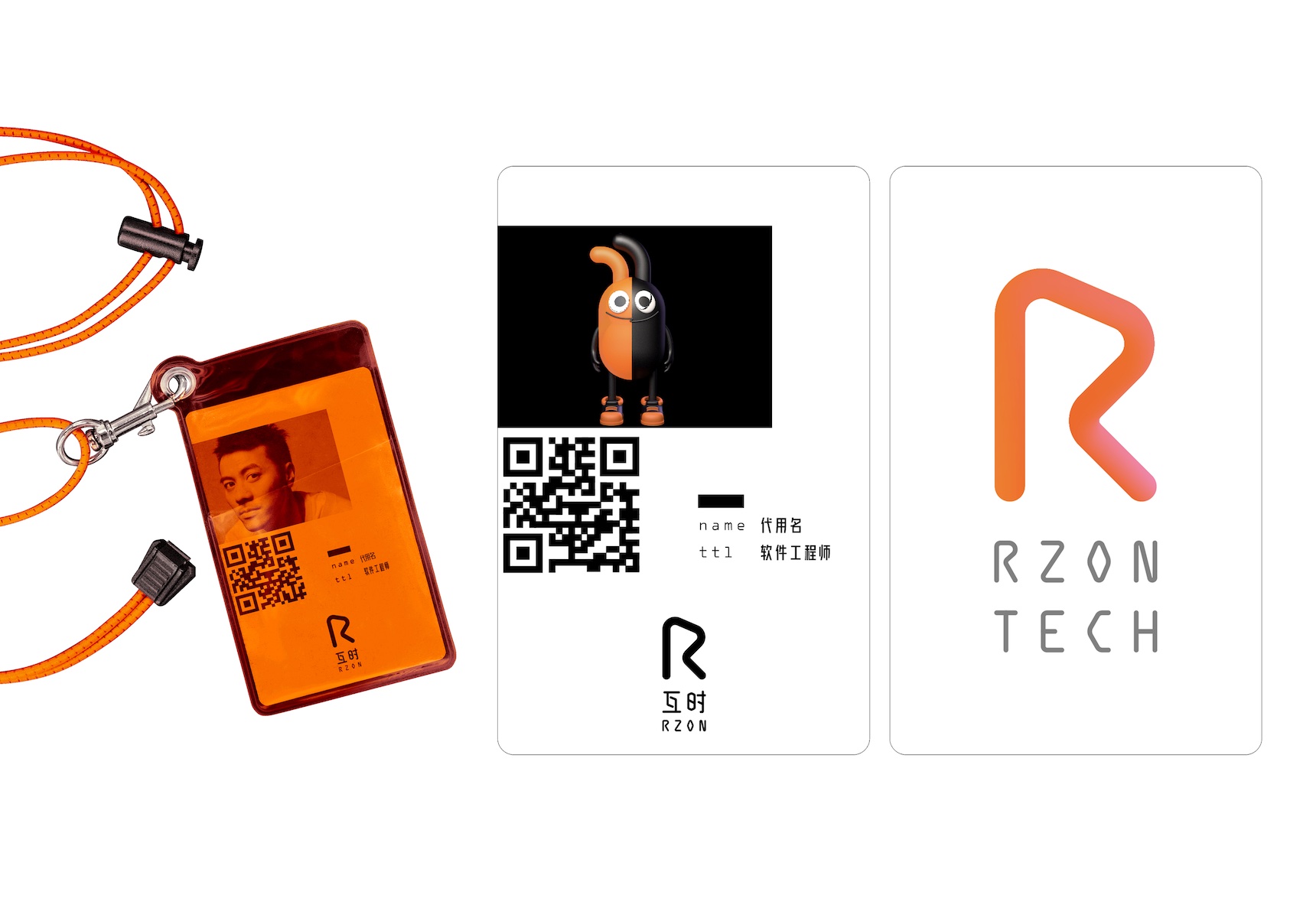
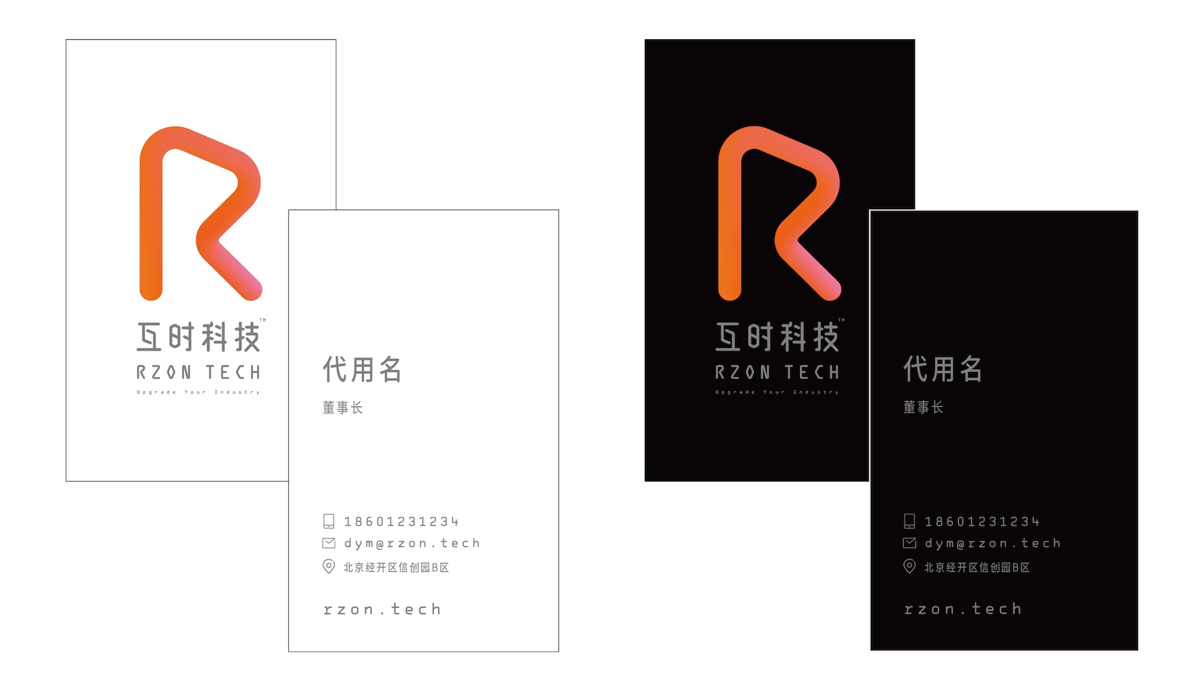
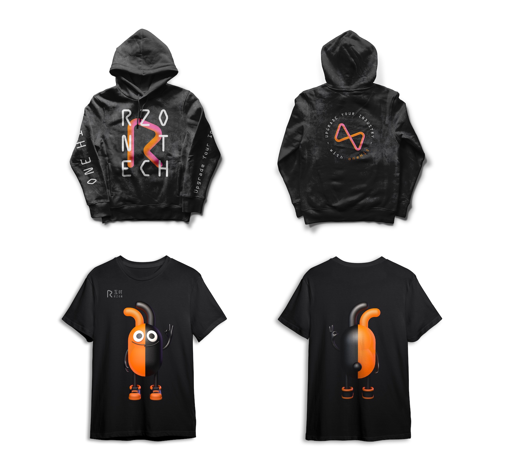
Focusing on serving Chinese industrial enterprises, RZON Tech wants to make a systematic rebranding for its corporate brand image. The new design takes the concept of interaction as the starting point, incorporating the three-dimensional thinking of time and space, showing different perspectives of the same shape, reflecting the process of interaction and change of each other. The four letters R Z O N express the visual image of RZON Tech, and convey the corporate philosophy of faithful partnership (Relationship), interesting technology experience (Zest), prudent professional observation (Observe), and standardized technical competence (Norm).
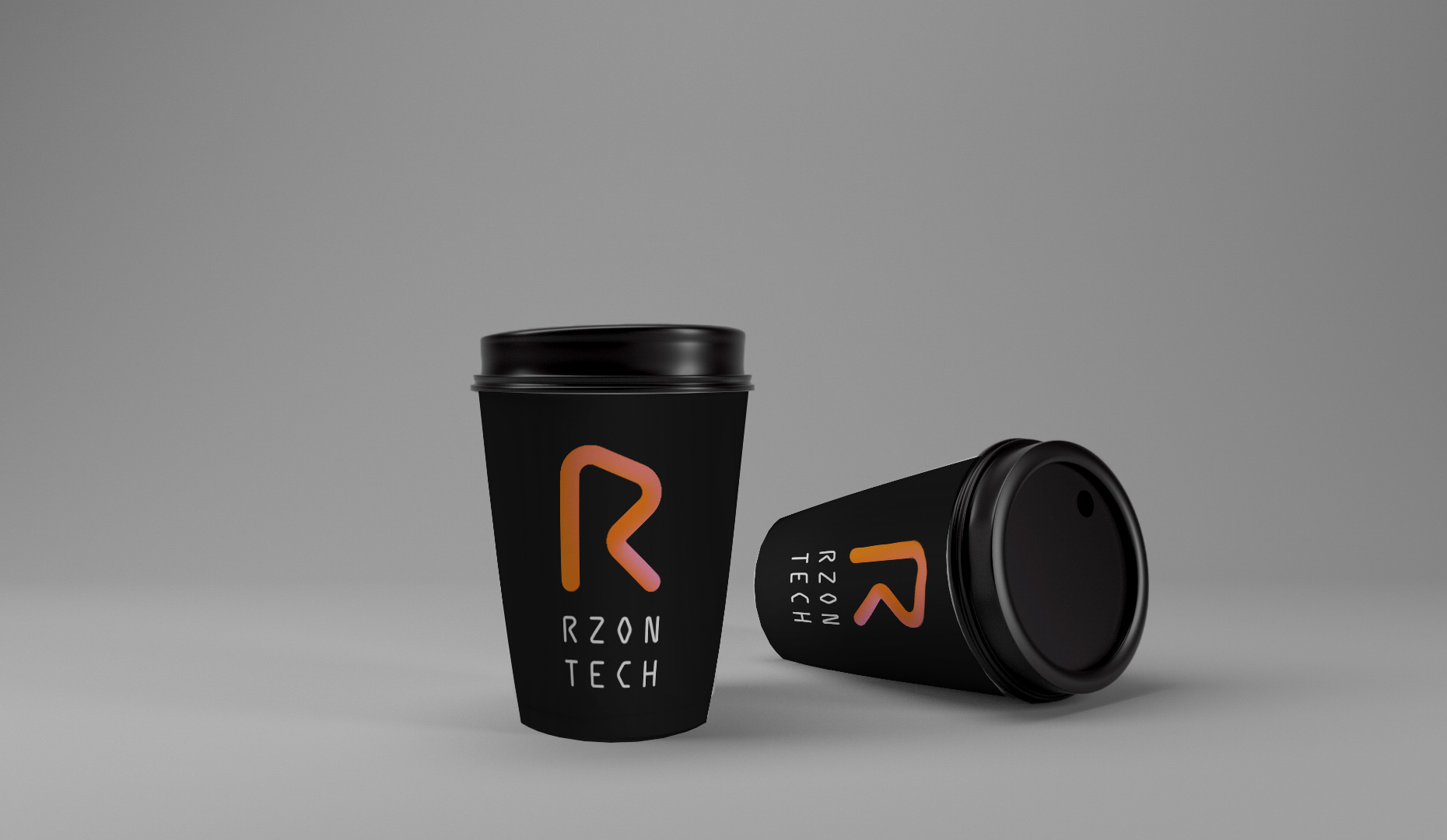
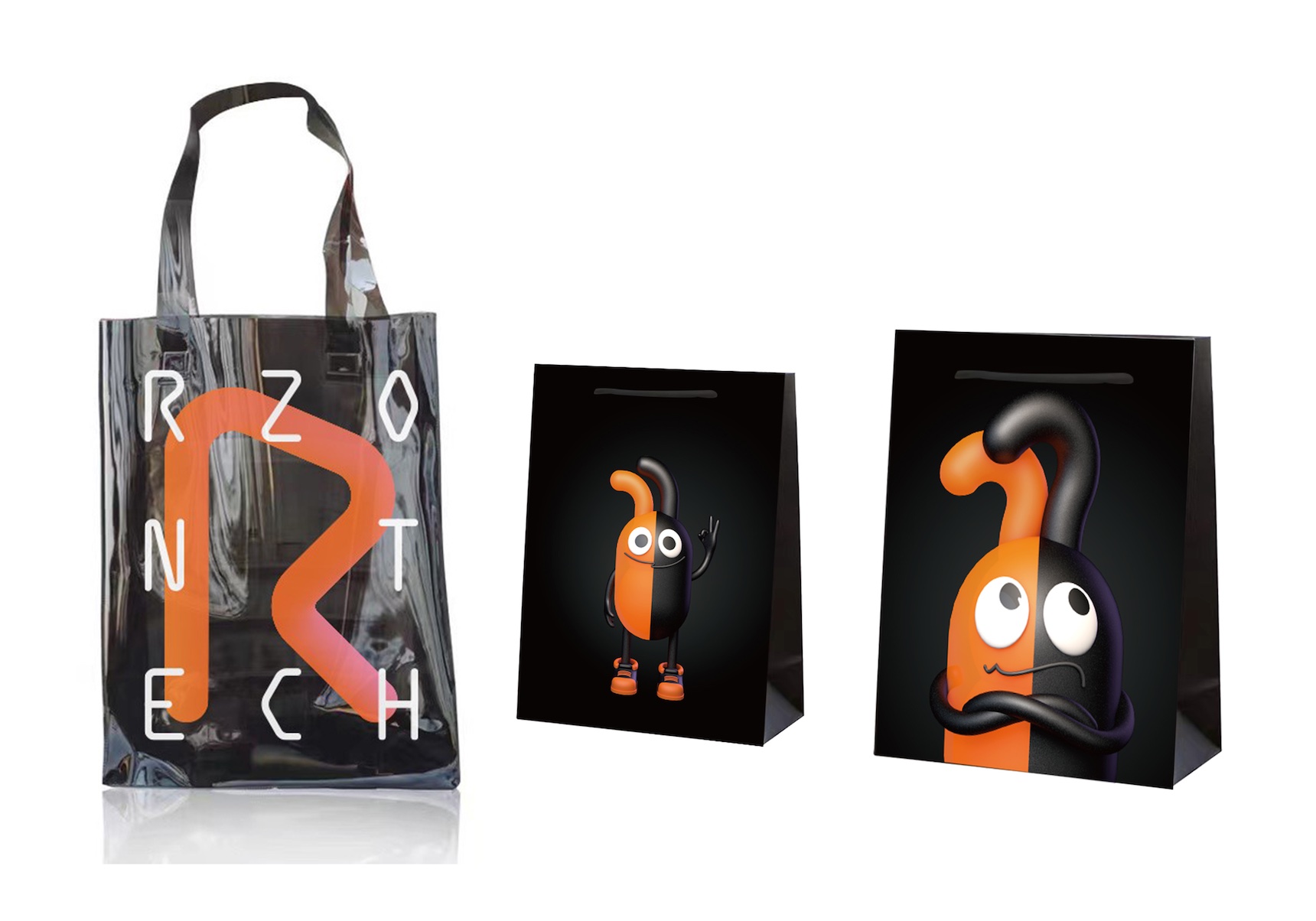
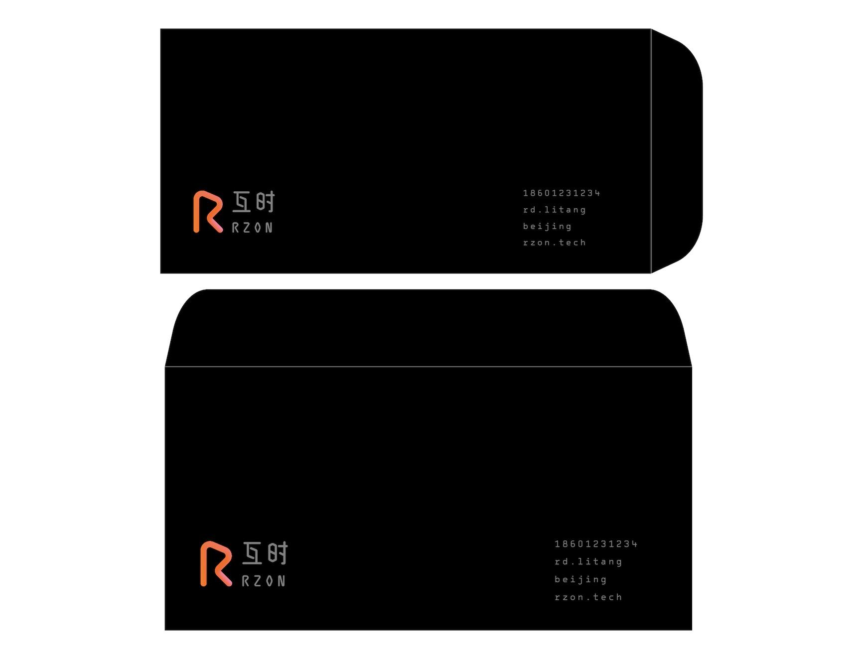
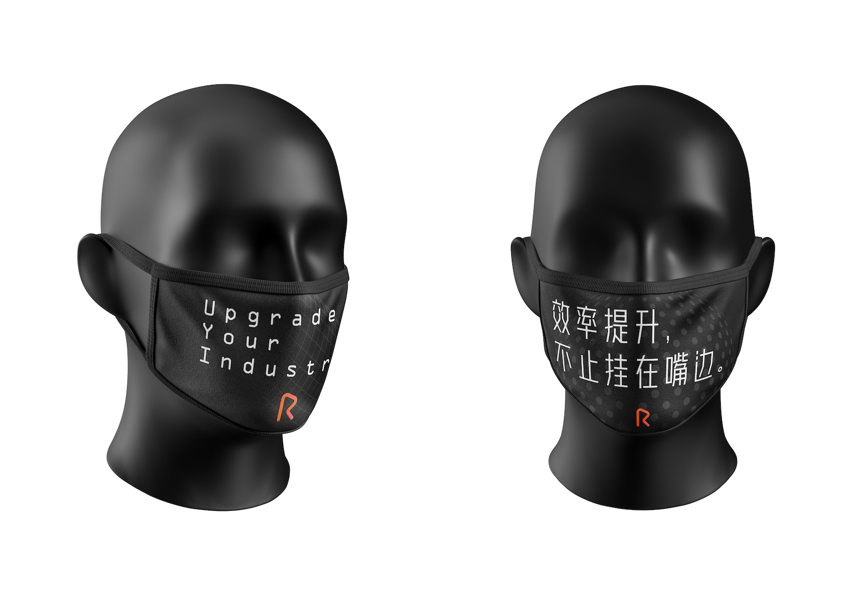
In the design and application part, the faux code style font and bright orange color are used to express the professionalism and energy of the company, and to create a distinctive sense of technology. In the new design, the interplay of the whole picture and details has completed the rebranding of RZON Tech, which is creating a "trendy brand" in the industrial software field.
Credits


Entrant Company
ID International
Website - Food & Beverage
Country / Region
United States


Entrant Company
WebMechanix
Digital Marketing - Branding / CI
Country / Region
United States


Entrant Company
Solodev | DigitalUs
Website - Government
Country / Region
United States
