
2025
Packaging | FWP Products
Entrant
Future World Products
Category
Digital Illustration (Single) - Packaging
Client's Name
Country / Region
Peru
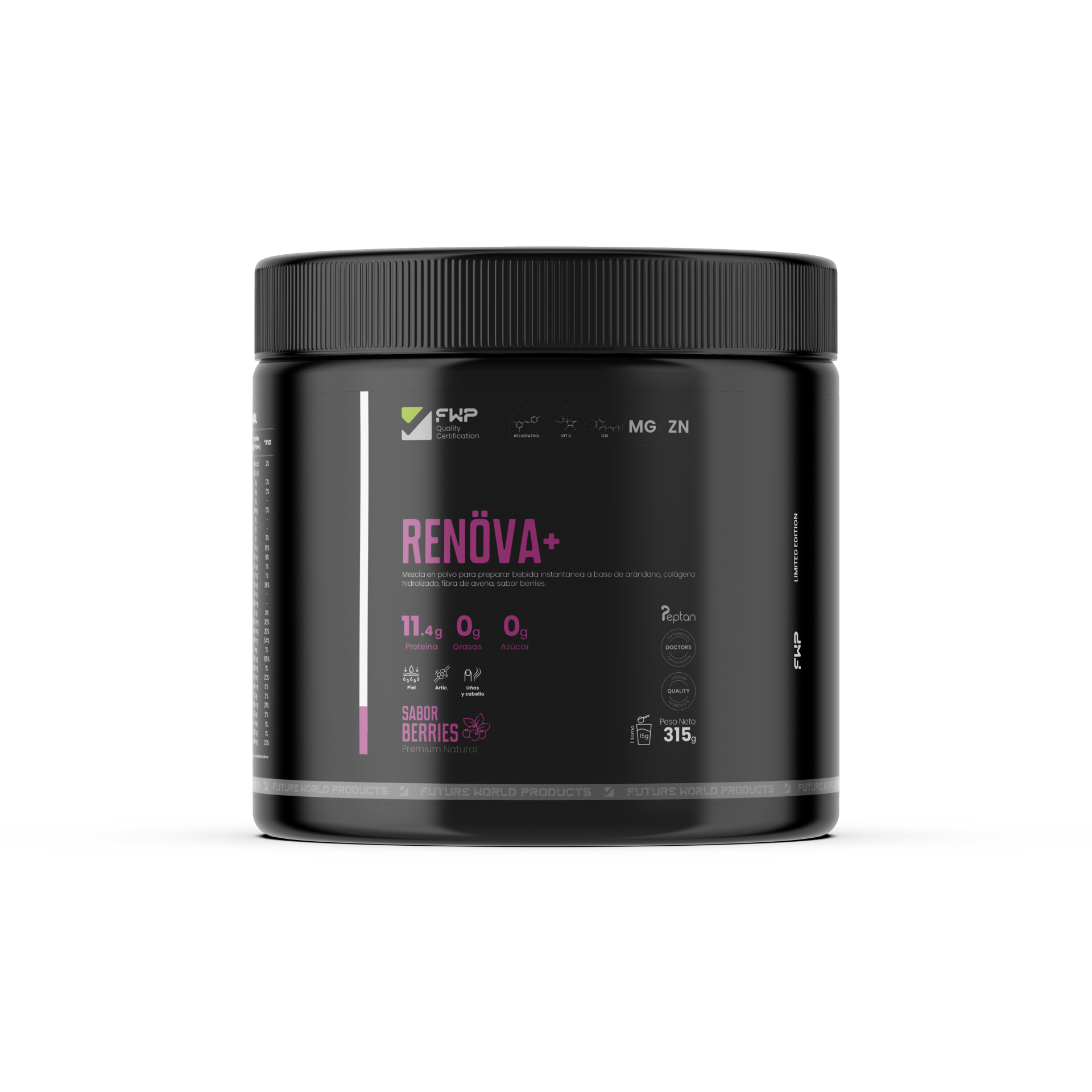
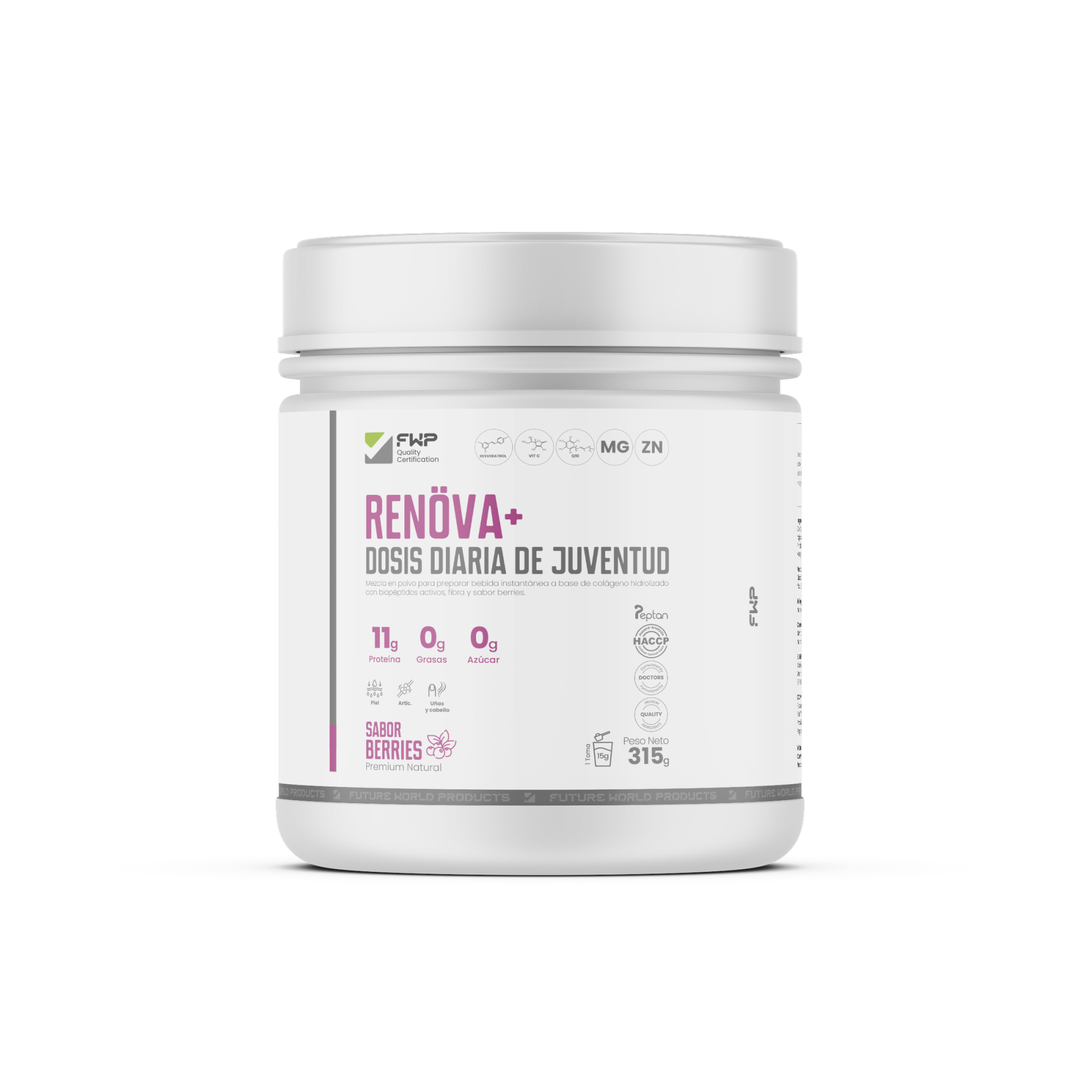
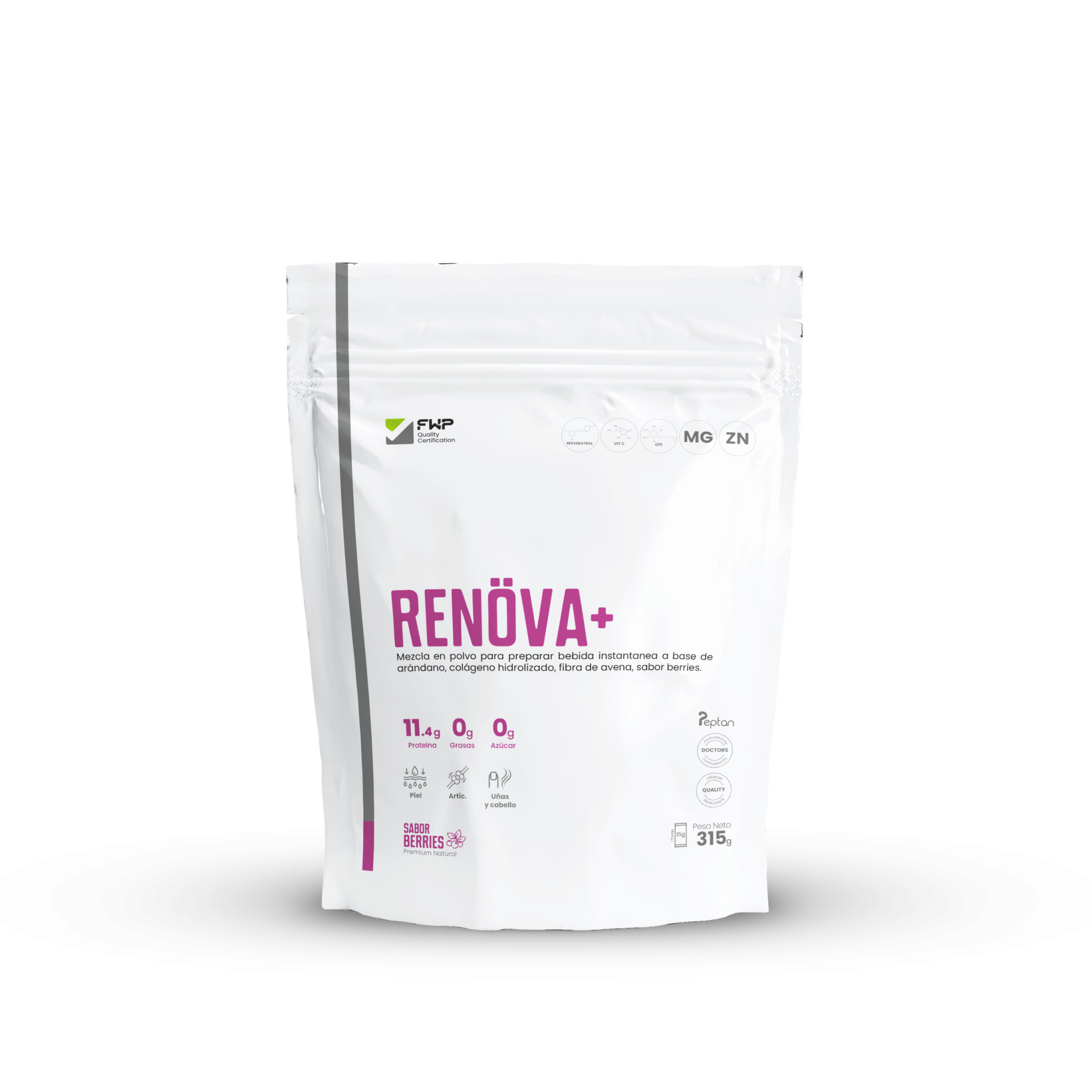
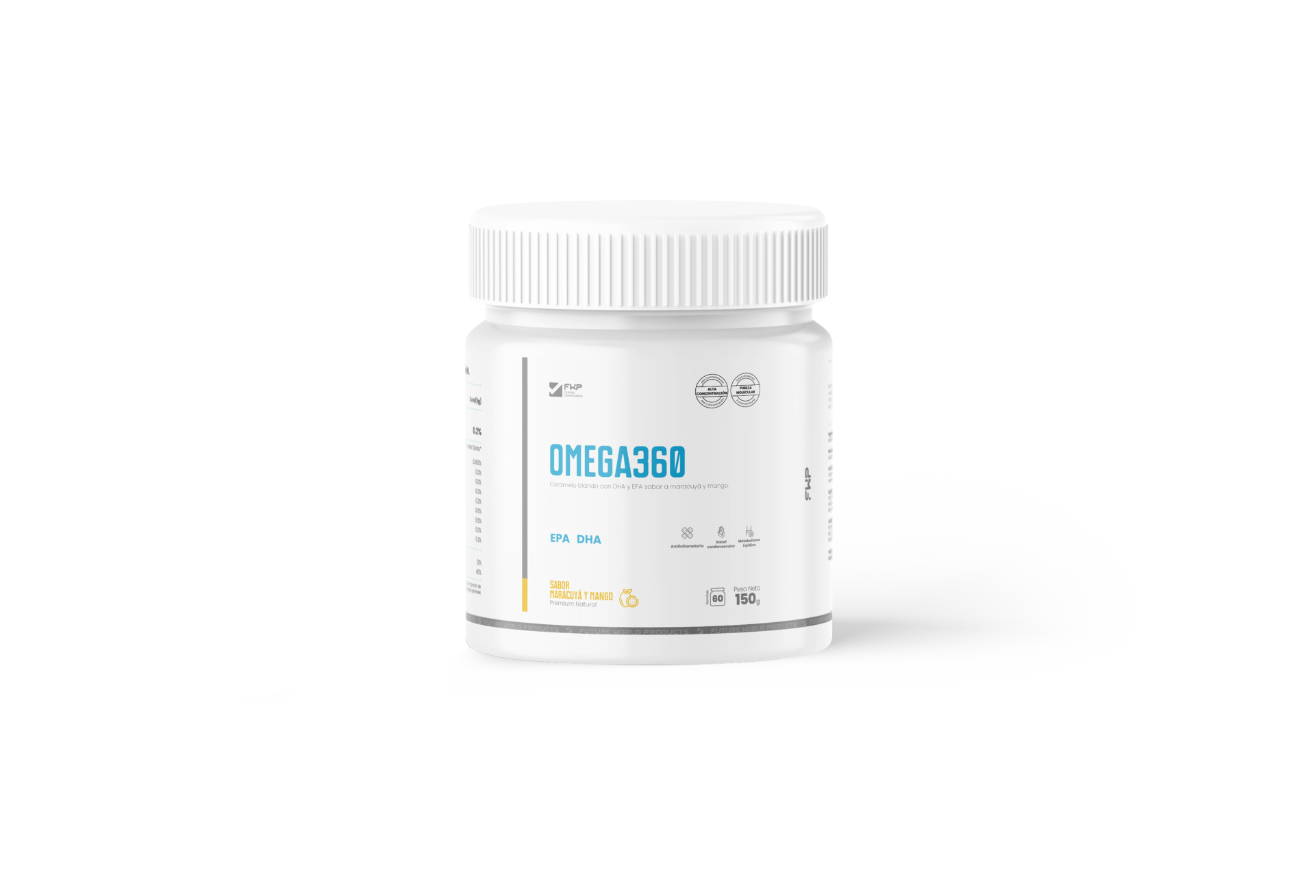
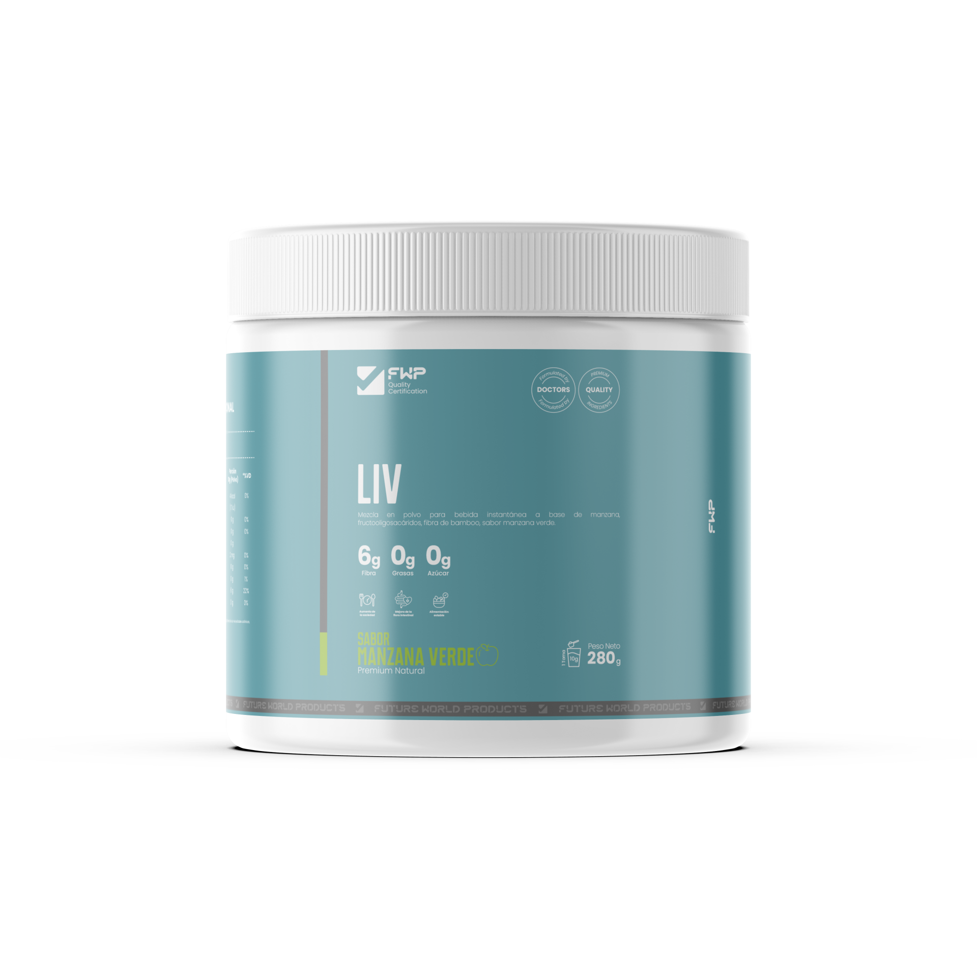
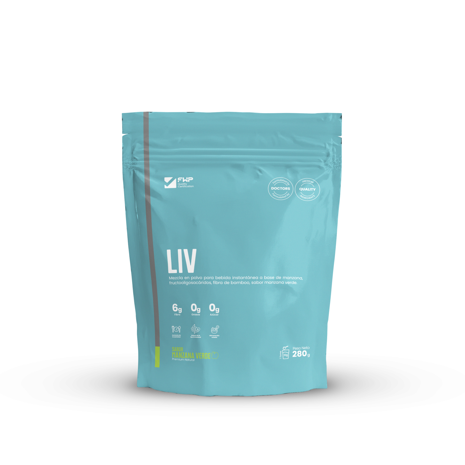
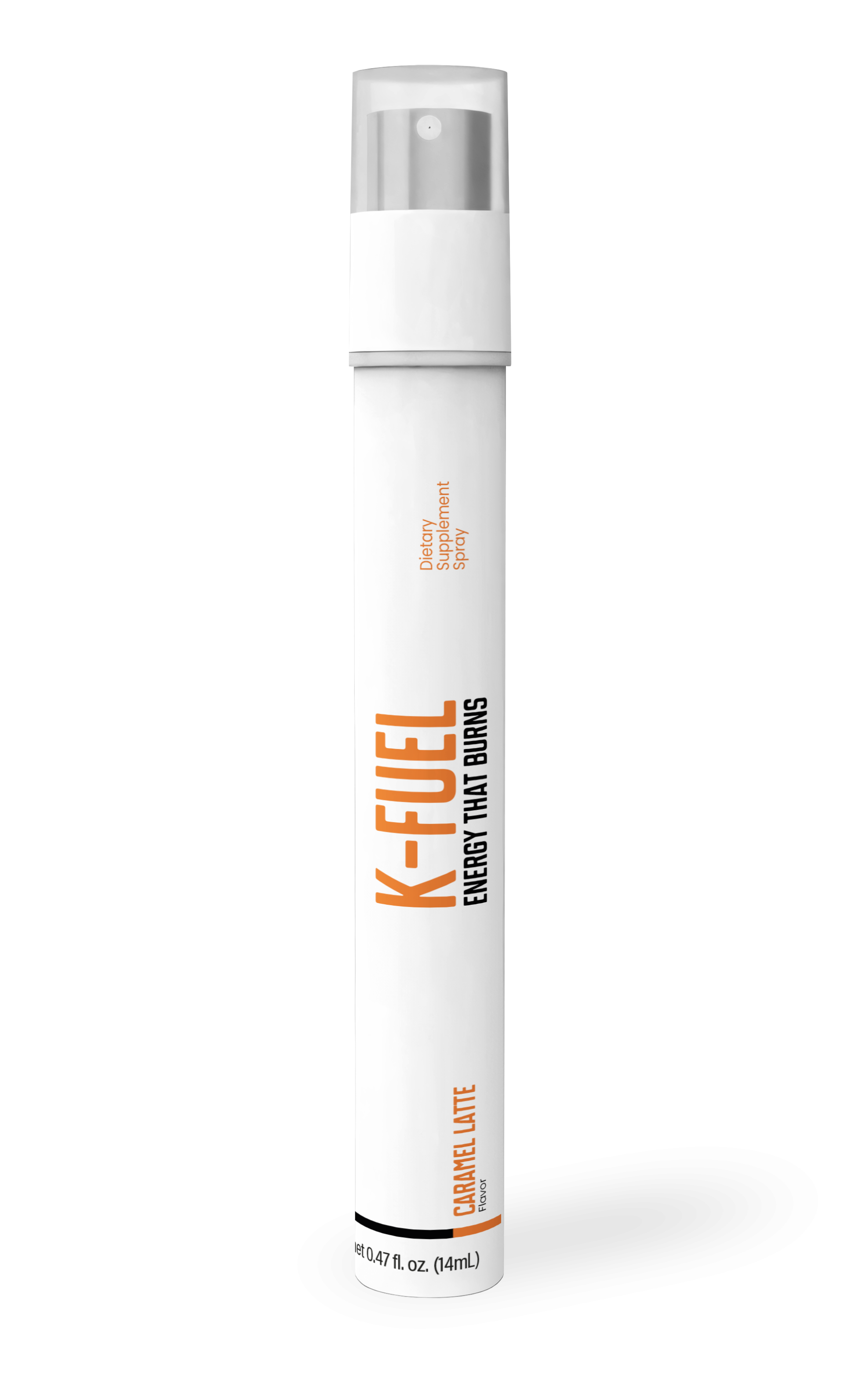
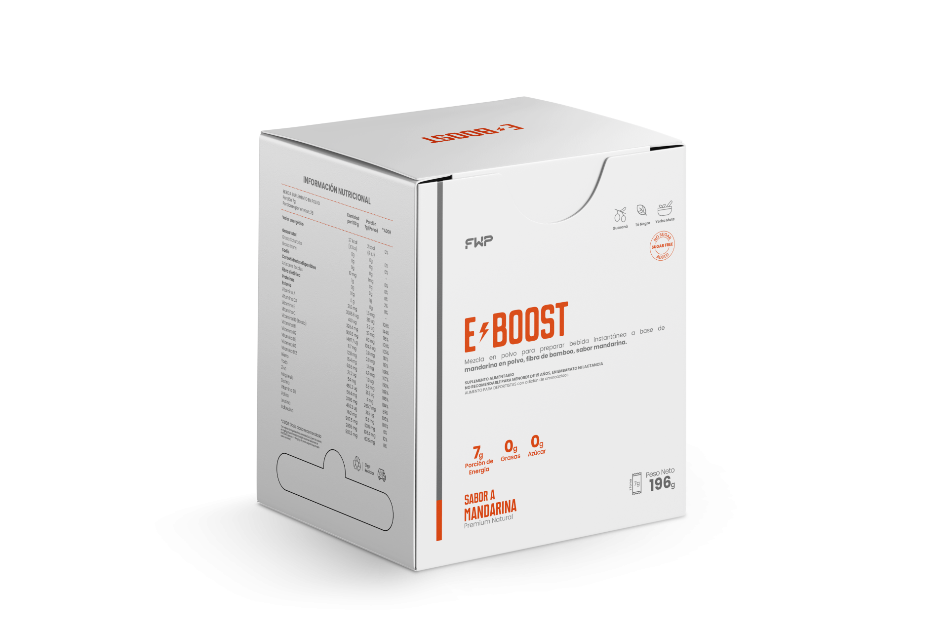
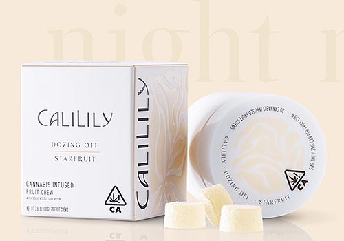
The packaging design for the FWP product line was a strategic initiative created to elevate brand identity, reinforce the perception of quality, and establish a modern, functional, and distinctive visual language. The project was driven by a clear vision: each package should not only present a product but also communicate FWP’s purpose of inspiring well-being, innovation, and balance. Brand Strategy: Clarity, Consistency, and Purpose The process began with a detailed analysis of the portfolio and its existing visual experience. Based on this evaluation, a strategy was defined to unify the overall visual identity, express well-being through simplicity, elevate the brand’s premium perception, and ensure each package acted as an ambassador of the FWP purpose. The brand aimed to communicate genuine well-being and promote a more conscious, balanced lifestyle. To achieve this, a visual system was created to reflect calm, confidence, and modernity. Creative Concept: “Well-being elevated to its essence” The creative concept sought to synthesize the essence of well-being into a clear and contemporary look and feel. This direction produced an aesthetic built on modern minimalism, clean and functional palettes, balanced compositions, geometric typography, and universal iconography. The intention was to communicate order, purity, and purpose. Through this approach, the packaging conveys well-being and innovation without visually overwhelming the user, ensuring a refined and approachable experience. Product Visual Architecture The system ensured that each product maintained its own identity while remaining part of a coherent visual structure recognizable across all presentations. This was achieved through standardized information placement, a defined hierarchy between product name, benefits, and ingredients, strategic use of color to differentiate categories, and the consistent application of FWP visual codes. As a result, the portfolio became visually harmonized, easy to navigate, and aligned with a premium editorial style. Functional and Experience-Oriented Design Beyond aesthetics, the packaging was designed to improve the consumer experience through immediate legibility, clear instructions, supportive symbols, durable materials, and adaptability across multiple formats. Every decision focused on creating a seamless, modern, and reliable interaction. Result: Packaging with Identity, Purpose, and Differentiation.


Entrant
Freelancer - Yangying Ren
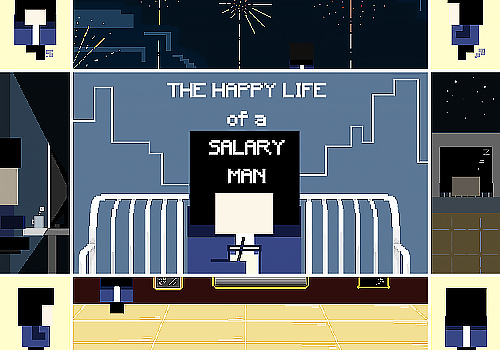
Games (Campaign) - Social Impact
Country / Region
United States

Entrant
oneteam™ - a partnership between kabookaboo x Affinity Creative Group
Website & Mobile Sites (Single) - Lifestyle
Country / Region
United States

Entrant
Anzhi Li
Digital Illustration (Single) - Arts & Culture
Country / Region
United States

Entrant
Sanya Liaoqu Culture Communication Co., Ltd.
Video / Online Video (Single) - Educational
Country / Region
China