2021
RIT course management website redesign
Entrant Company
Rochester Institute of Technology
Category
Student - Website - Website Redesign
Client's Name
Country / Region
United States
Entry Level
Student
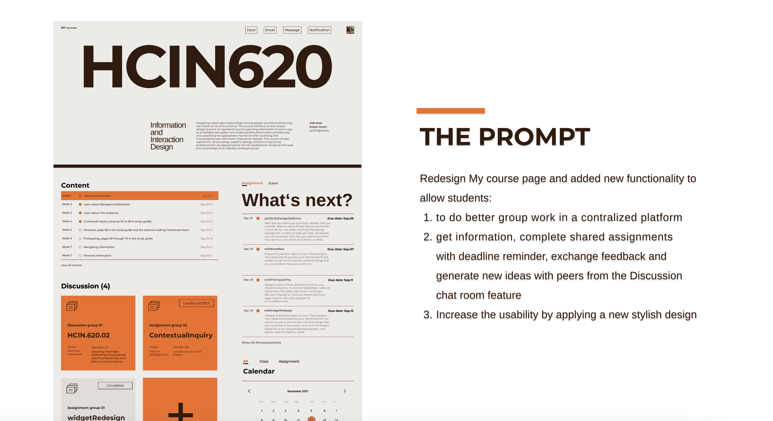
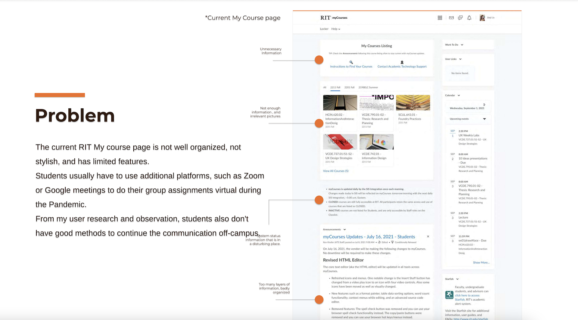
The project is about a redesign of the RIT ‘My Course’ page. The current site is not well organized, not stylish, and has limited features. RIT Students usually have to use additional platforms, such as Zoom or Google meetings, to virtual group assignments during the Pandemic. From my project user research, students in RIT need available methods to continue the communication off-campus. So I decide to redesign the ‘My Course’ homepage and content page by mainly two processes.
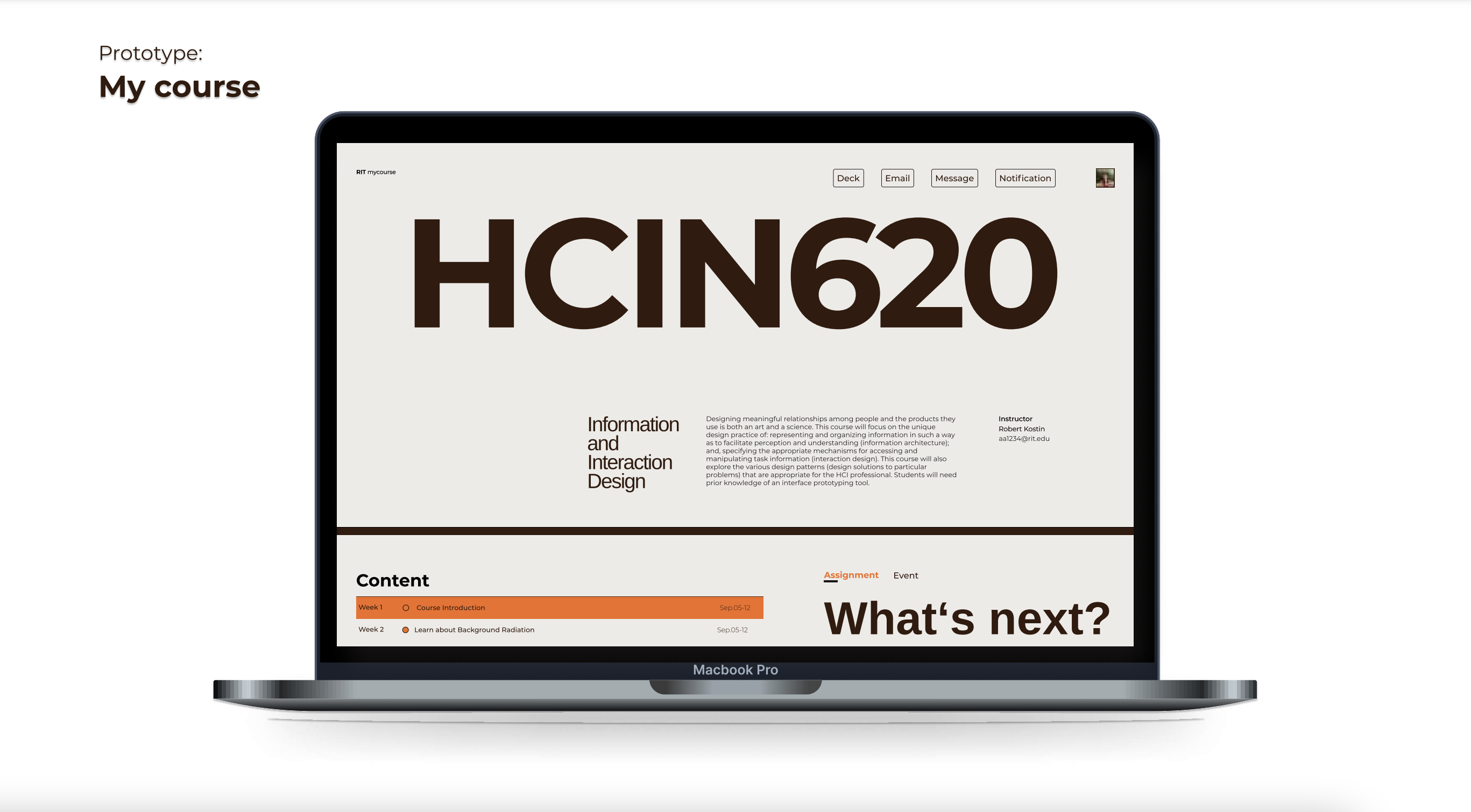
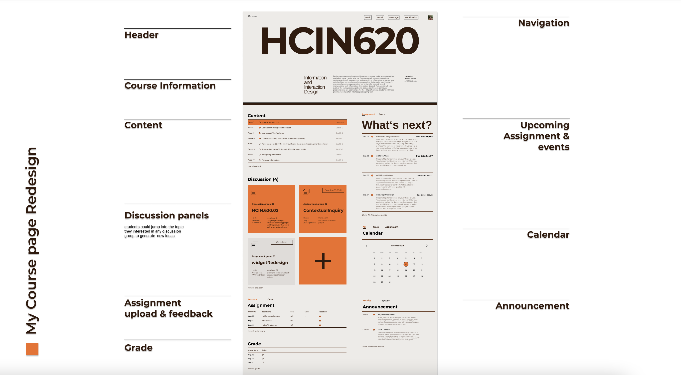
First, the project involves a visual redesign of the website with the inspiration of Swiss Design style. While keeping the original RIT orange color and tiger element, the website was rebranded with a new color theme, a new layout grid, refreshed typography, and updated interface styles. The new visual will show a better information hierarchy and provide a smooth and pleasing reading experience.
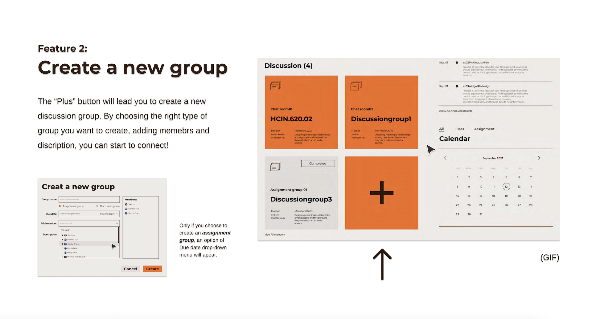
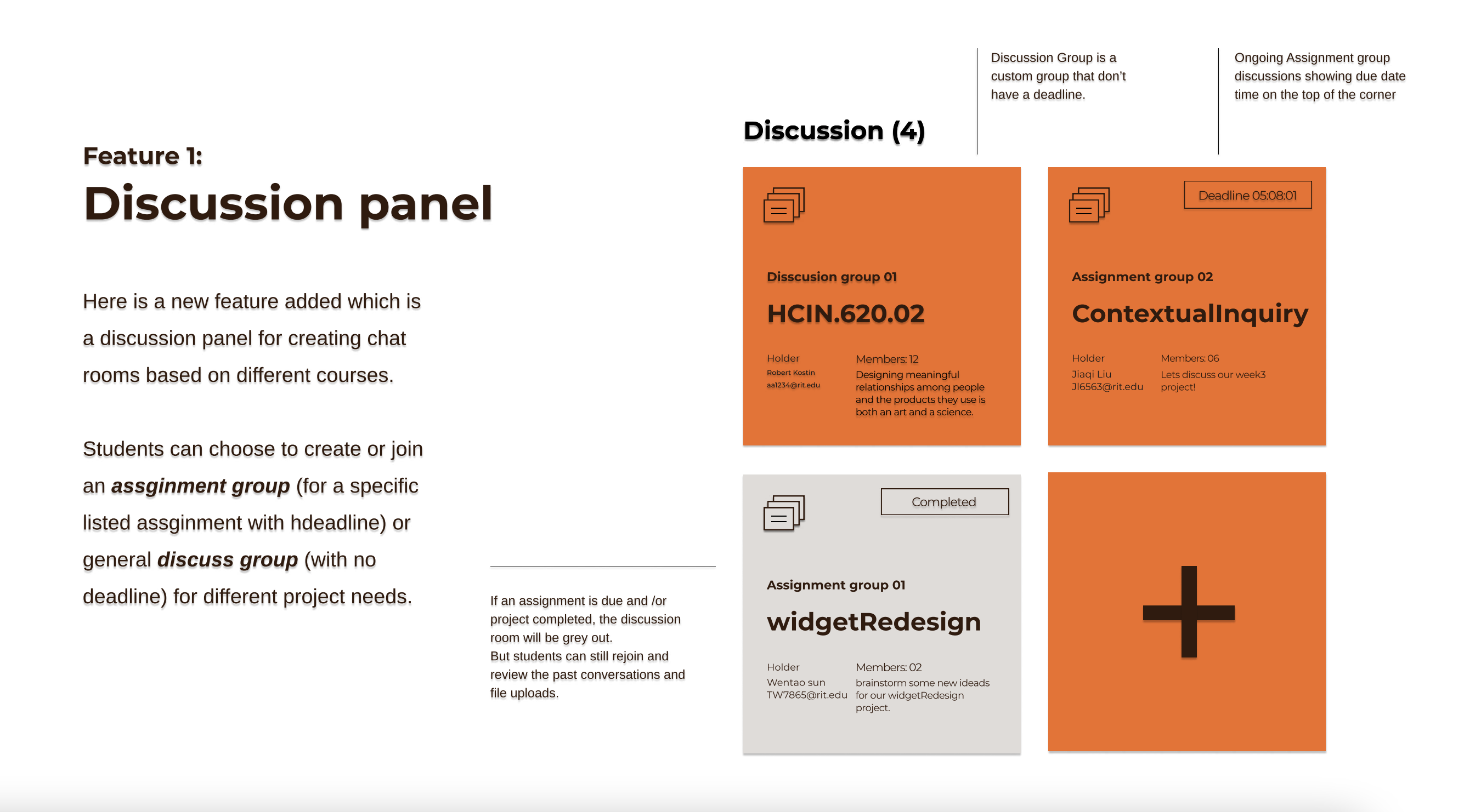
Second, a closely course/assignment-based chat room function is added. While taking count the need and goals of students, the chat room helps them connect, complete projects efficiently, and achieve growth off-campus. Overall, the redesign of the website will allow the students to achieve their academic and social goals efficiently and appeal to the users both visually and functionally.

Entrant Company
Maryland Institute College of Art
Student - Digital Illustration - Innovation
Country / Region
United States


Entrant Company
Parnaso
Video / Online Video (Single) - Budget below $3000
Country / Region
Spain

Entrant Company
Directive Consulting
Website - Business to Business
Country / Region
United States
